I've had some people ask me about my photographs. They have commented about how beautiful they are and asked what's my secret. Well, let me tell you they weren't always this way. Take a look HERE at my very first Sugar Creek Hollow post. The card may be pretty but the photo doesn't do much to accentuate it. Enter Tracy. Tracy is the owner of Sugar Creek Hollow and Weekly Challenge Blog and has taught me so much about "staging" my photos. I'd say 95% of what you see is from her and about 5% I've taught myself. Here is a step by step photo tutorial from start to finish on how I take the photo right up until it's ready to publish. Although photo staging isn't necessary you can see it does make quite a difference and adds beauty to your already beautiful creations.

Step 2. I load my photo onto my computer and using my photo software that came from my camera I crop the photo, give it name and save it.

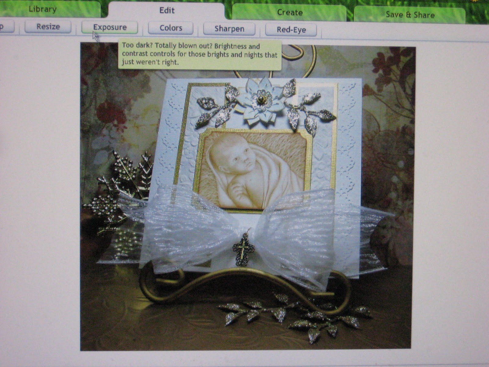
Step 3. I open up my photo in a free on line photo editing software called Picnik.
The first thing I do is go to the "EDIT" tab and fix the exposure if it needs it. You can also tweek the colors, sharpness etc. here. Don't be afraid to try different things because there's an undo button if you don't like the changes you've made.
Step 4. Once my photo has the quality that I want I add the fun stuff! There are MANY different tools to play with under the "CREATE" tab. My favorite is to add the Matte feature which softens the edges.


Step 5. Next I add my "watermark" using the add text button. You can use different colors and "fade" it so that's it's not so bold on your photo that it distracts the viewer away from your photo.

Step 6. My next step is to add a border. There are several different ones to choose from and you can change the colors to match your photo. I use many different ones depending on my mood.

Here I've used the plain border.

After I added the plain border I used the Museum Matte border around that.

Soooo.... which do you think looks better? The photo above or my old photos. (See below)

I hope you found this helpful and if you have any questions just ask. I'll answer anything that I can.
I will be away from my computer today, tomorrow and Sunday though so if you e-mail I'm not ignoring you. I'll get back to you as soon as possible.
1 comment:
Thanks for the tutorial Renee, I have been battling with PSE for months, I am going to give this a go and see what develops!
By the way your card and setting is stunning, definitely better than your old photos. I hope I can improve the same way.
Smiles:)
Post a Comment